Brand Guidelines
We are Pulseboard. Every metric, one heartbeat.
Follow these guidelines when you work with our brand. Here you'll find our brand assets, logo, typography, and color palette.
Our logo
The bar-pulse mark and the pulseboard word-mark are the core of our identity.
Primary
Default lockup for light surfaces.
Reversed
Use on midnight or photography.
Stacked
For square and centred layouts.
Mono
One-colour print and documents.
Mono reversed
One-colour on dark surfaces.
Mark
Standalone mark for tight spaces.
App icon
Avatars, favicons and app tiles.
Brand banners
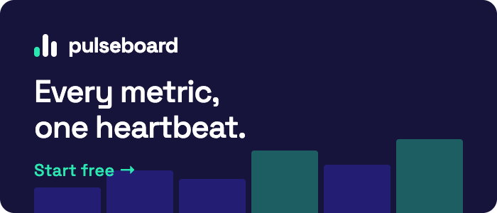
Reversed. Mint mark and white word-mark on midnight — our default for dark surfaces and ads.
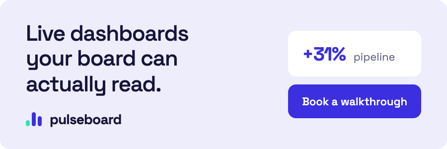
Primary. Midnight word-mark on lilac tint, with indigo reserved for calls to action.
Typography
Our typeface is Plus Jakarta Sans for all headlines and body copy. Bold for headlines, Regular for body copy.
ABCDEFGHIJKLMNOPQRSTUVWXYZ
abcdefghijklmnopqrstuvwxyz
Color palette
Color is in order of importance, from Midnight as our base, to Lilac Tint as the quietest surface.
Midnight
#16143A
Indigo
#3B2FE0
Mint
#2BE6B0
Lilac Tint
#EEEDFB
Core values
Clarity
Every chart earns its place. If a number doesn't drive a decision, it doesn't ship.
Signal
Live dashboards your board can actually read — one heartbeat across every metric.
Trust
Accurate, auditable data. Teams should never have to double-check the dashboard.
Pull brand from a URL
Paste a brand guidelines URL to extract its logo, favicon, fonts and colour palette — the same signals an external brand scraper reads from this page.